Introduction
Your LinkedIn campaign is humming. Targeting is dialed in, click-through rates look healthy, and the ads themselves are getting engagement. Then the traffic hits your landing page and conversions stall.
This gap is expensive. Recent B2B benchmark data from HockeyStack, based on 70+ B2B SaaS companies and $28 million in ad spend, found LinkedIn CPCs swinging from $10.48 in Q1 to $15.72 in Q3. Every click that lands on a page that doesn't convert is money spent for nothing.
The most common culprit? Sending LinkedIn clicks to a generic homepage or a landing page built for Google Ads. At Beyond the Funnel, we've seen this mistake sink campaigns that otherwise had excellent targeting—often after managing the pattern across hundreds of LinkedIn ad accounts.
This article covers what makes LinkedIn landing pages different, the design principles that move conversion rates, a proven page structure, and the mistakes that quietly waste spend.
Key Takeaways
- Treat LinkedIn visitors as cold scroll traffic—not search-intent buyers like Google Ads
- Match your landing page headline to the ad or bounce rates climb fast
- Scale form length to funnel stage instead of using one form for every offer
- Use scroll depth and heatmaps—conversion rate alone hides page friction
- Test one variable at a time to turn guesswork into repeatable gains
What Is a LinkedIn Ads Landing Page?
A LinkedIn Ads landing page is a standalone, single-focus page built to convert clicks from one specific LinkedIn ad into leads, signups, or sales. Unlike your homepage, it has one job: get the visitor to take one action.
Self-Hosted Pages vs. LinkedIn's Native Feature
Most B2B advertisers build landing pages using tools like Unbounce, Instapage, or their own CMS. These self-hosted pages are the destinations for standard Sponsored Content and Message Ads.
LinkedIn also has a native "Landing Pages" feature inside Campaign Manager. It looks similar but works differently:
- Requires an active LinkedIn Recruiter contract
- Built specifically for Talent Lead campaigns (hiring-focused, not standard demand gen)
- Not available to advertisers running typical B2B lead-gen campaigns
If you're advertising a product, service, or content offer, you'll be building a self-hosted page. That's the focus of this article.
The Core Job of a Landing Page
Every high-performing landing page shares three traits:
- One clear call to action, not three competing offers
- Tight message match to the ad that drove the click
- A frictionless path from arrival to conversion (download, signup, or demo request)
Why LinkedIn Landing Pages Need a Different Approach Than Google Ads
Treating LinkedIn traffic like Google traffic is one of the most reliable ways to underperform. The two channels deliver fundamentally different visitors.
Google Ads traffic is high-intent. Someone searched a specific term and clicked because they're actively looking for a solution. LinkedIn traffic is interrupted. Someone was scrolling their feed, saw your ad, and clicked out of curiosity or partial interest, not urgent need.
That difference matters because B2B buyers don't convert on the first touch. According to McKinsey's 2024 survey of nearly 4,000 B2B decision-makers across 34 sectors, buyers use an average of 10 interaction methods before purchasing, including company websites, sales calls, and video conferences.
Cold vs. Warm: Design for the Journey, Not Just the Persona
Most marketers design landing pages around who the visitor is: job title, industry, company size. That's necessary but incomplete.
Equally important is where the visitor is in their journey:
- Cold prospecting audiences need education and trust-building first. A hard sell here spikes bounce rate.
- Warm retargeting audiences already know your brand. They're ready for a stronger CTA and a more direct offer.
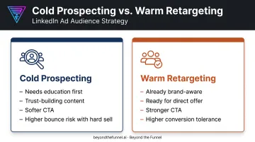
A cold prospect landing on a page demanding a demo request will bounce. A warm retargeting visitor landing on a top-of-funnel eBook offer will feel like the page is wasting their time. Match page depth and CTA strength to where the visitor actually is.
Look Beyond the Final Conversion Number
Conversion rate tells you the outcome, not the story. Track leading indicators too:
- Scroll depth (are visitors reaching your offer details?)
- Heatmap click patterns (what are they actually engaging with?)
- Time on page before exit (are they skimming or actually reading?)
These signals often reveal a fixable problem before it shows up as a conversion rate crash.
Essential Design Principles That Convert
Once you understand how LinkedIn traffic behaves differently, your landing page design has to match that behavior.
Message Match and Above-the-Fold Clarity
Your landing page headline, imagery, and offer must mirror the exact promise made in the ad. If someone clicks an ad promising "The 2025 B2B Benchmark Report" and lands on a page headlined "Grow Your Pipeline," they'll assume they clicked the wrong thing. That mismatch destroys trust instantly and drives immediate bounces.
Above the fold, include:
- An eyebrow label above the headline (for example, "Free Guide" or "Live Webinar")
- A benefit-driven headline under 10 words
- A concise subheadline that adds one supporting detail
- The lead form, visible without scrolling
Form Friction and Social Proof
Field count should match funnel stage, not stay identical across every offer:
- Top-of-funnel (eBooks, guides): email only, or email plus name
- Mid-funnel (webinars, assessments): 3-5 fields
- Bottom-funnel (demo requests): more fields are acceptable since intent is higher
Social proof works best when it's specific. Vague praise like "Great partner to work with" doesn't move anyone. Quantified outcomes do.
When Beyond the Funnel worked with Evidation on a full LinkedIn strategy, pipeline grew from a few dozen opportunities to over 100 opportunities in one year, according to former Head of Commercial Marketing Michael Arbini. Feature that kind of named, quantified result—with name, title, and company attached.
FAQ Placement and Mobile Speed
FAQ sections earn strong engagement on B2B landing pages by addressing objections around pricing, timing, and fit before a visitor bounces. Don't bury this section at the bottom—test it higher on the page rather than assuming it belongs last.
With significant LinkedIn traffic arriving on mobile, page speed is critical. Google's Core Web Vitals guidance defines a good Largest Contentful Paint at 2.5 seconds or less, measured at the 75th percentile, according to web.dev's official performance documentation.
To hit that bar:
- Compress images before upload
- Avoid embedded video players that slow initial load
- Size buttons and form fields for thumbs, not mouse pointers
Anatomy of a High-Converting LinkedIn Landing Page
Structure matters as much as individual elements. Here's the top-to-bottom sequence that converts cold LinkedIn traffic:
- Above-the-fold block: Eyebrow text, headline, subheadline, lead form, and an action-oriented CTA. "Get the Guide" outperforms generic buttons like "Submit" because it restates the value.
- Trust bar: A row of recognizable customer logos, or a simple "Trusted by 200+ companies" line, placed just below the fold to reassure skeptical cold traffic.
- Value/body section: Benefit-focused bullets on what's inside the offer, plus a "who this is for" filter that screens out unqualified visitors before they submit.
- Social proof and FAQ block: Testimonials with specific, quantified outcomes, followed by a short FAQ that handles common objections.
- Closing section: A brief about/company block for credibility, then a final CTA that repeats the core offer and form.
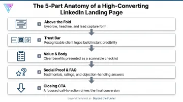
The sequence moves a cold visitor from curiosity to trust to detail to proof to action, without asking for commitment before it's earned.
Common LinkedIn Landing Page Mistakes to Avoid
Three mistakes show up repeatedly on underperforming LinkedIn campaigns:
- Sending clicks to a generic homepage. Visitors have to hunt for relevance, and most won't bother. A single-focus page converts far better than a multi-purpose homepage.
- Reusing the same page for LinkedIn and Google Ads. Search visitors arrive with intent; LinkedIn visitors arrive interrupted. A page built for one weakens relevance for the other.
- Asking for too much information upfront. Phone, company size, or budget fields on a cold offer suppress conversions without a lead-quality gain that justifies the drop.
Each of these is fixable without a redesign. Build a dedicated page, match it to the traffic source, and keep the form as light as the offer allows.
Testing, Tracking, and Continuously Improving Your Landing Page
A landing page is never really finished. Treat it as a living asset you refine on a cadence, not a one-time build.
Test One Variable at a Time
Isolate variables so you know what actually caused the change:
- Headline wording
- Form length
- CTA button copy
- Social proof placement
Use conversion rate optimization tools or LinkedIn's own Campaign Manager reporting to compare results.
Watch Behavior, Not Just Conversions
Heatmap and scroll-tracking tools show what happens before someone converts, or before they leave:
| Capability | Hotjar | Microsoft Clarity |
|---|---|---|
| Click/tap tracking | Yes, with device-level distinction | Yes, across mobile, desktop, tablet |
| Scroll depth | Yes, with percentage detail | Yes, includes drop-off percentage by section |
| Additional overlays | Move maps, engagement zones | Area and attention maps |
Both tools help you spot which sections earn attention and where visitors disengage, informing your next round of edits.
Tie Page Data Back to Campaign Strategy
One-off tests rarely compound into real growth. Beyond the Funnel's testing and audience-validation framework, built from managing more than 1,000 LinkedIn ad accounts, connects landing page performance back into campaign-level creative and targeting decisions.
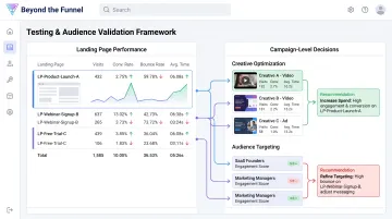
Instead of isolated experiments, each test result feeds the next round of ad creative, audience refinement, and page adjustments. Optimization becomes a repeatable process you can run on every campaign.
Frequently Asked Questions
What is a LinkedIn ads landing page?
It's a standalone, single-CTA page built to convert traffic from one specific LinkedIn ad. Unlike a company website, it has no navigation and one focused goal.
How is a LinkedIn landing page different from a regular website page?
A landing page removes site navigation and other distractions, keeping visitors focused on a single action. It also mirrors the specific ad's message far more tightly than a general website page would.
How many form fields should a LinkedIn landing page have?
Cold, top-of-funnel offers should stick to email only or email plus name. Save additional fields, like company size or phone number, for higher-intent offers like demo requests.
Do I need a different landing page for each LinkedIn ad campaign?
Pages should vary by offer and by how warm or cold the audience is, not just by campaign name. Reusing one generic page across different offers weakens message match and hurts conversions.
What's a good page load speed for LinkedIn landing pages?
Aim for a Largest Contentful Paint of 2.5 seconds or less, per Google's Core Web Vitals standard. Compress images and skip embedded video players to hit that target.
How can I tell if my LinkedIn landing page is actually working?
Track conversion rate alongside engagement signals like scroll depth, heatmap click patterns, and account-level visits. A page can show a decent conversion rate while still leaking qualified visitors before they ever reach your offer.